Branding a “Bank That Doesn’t Look Like a Bank”
Role: Sr. Art Director & Visual Brand Strategist | Collaboration: Accenture
Situation
Task: Build Japan’s first digital-only bank brand targeting Millennials & Gen Z.
Core paradox: break “bank-like” stiffness while maintaining trust.
Challenge
Gen Z sees banks as “complicated, boring, intimidating.”
Market saturated with colorful fintech brands; risk of blending in.
Internal resistance: black & white deemed “too risky, too simple.”
Action
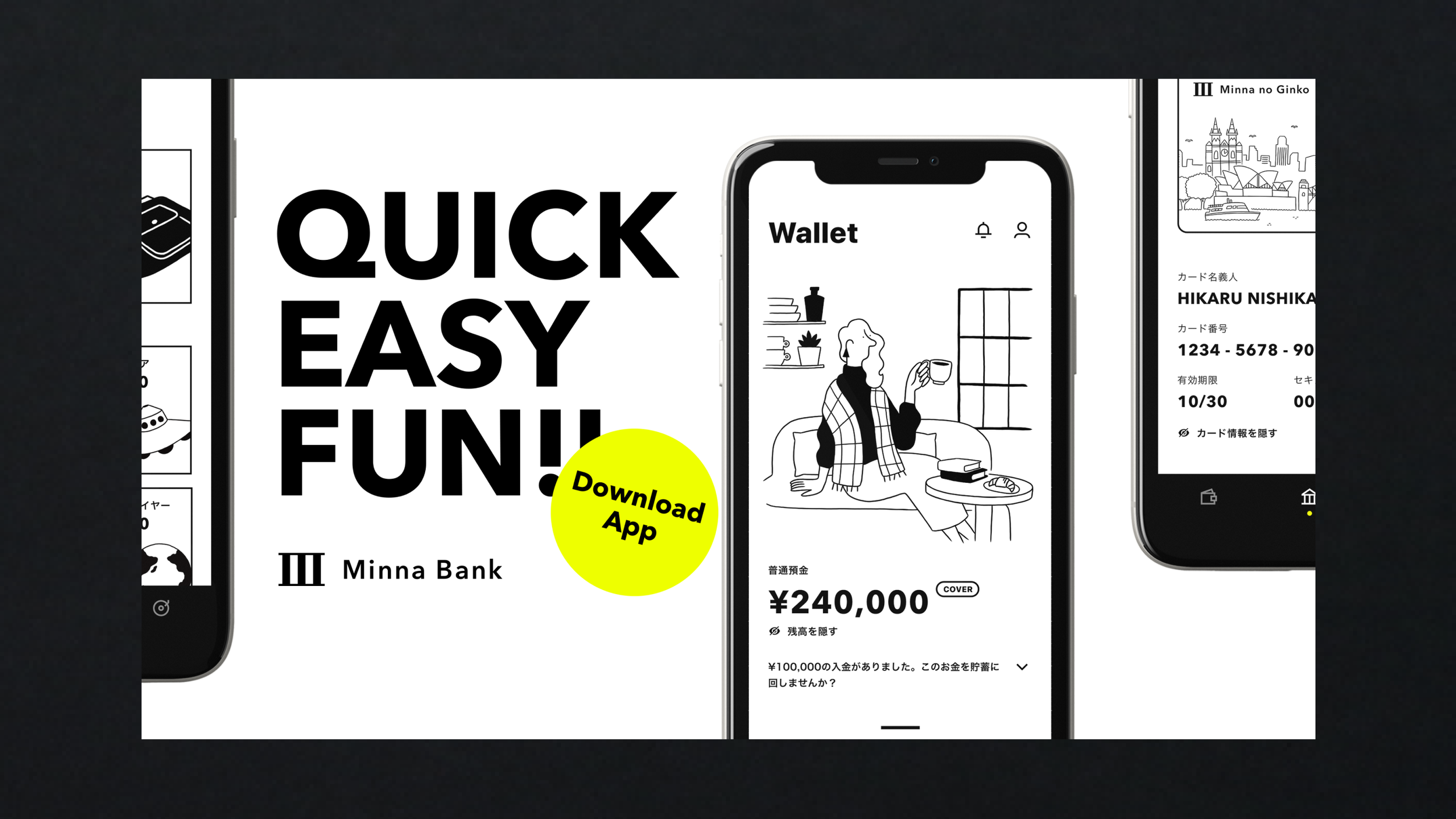
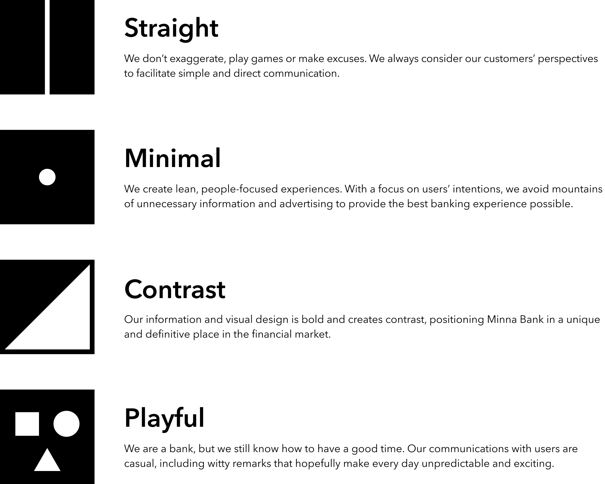
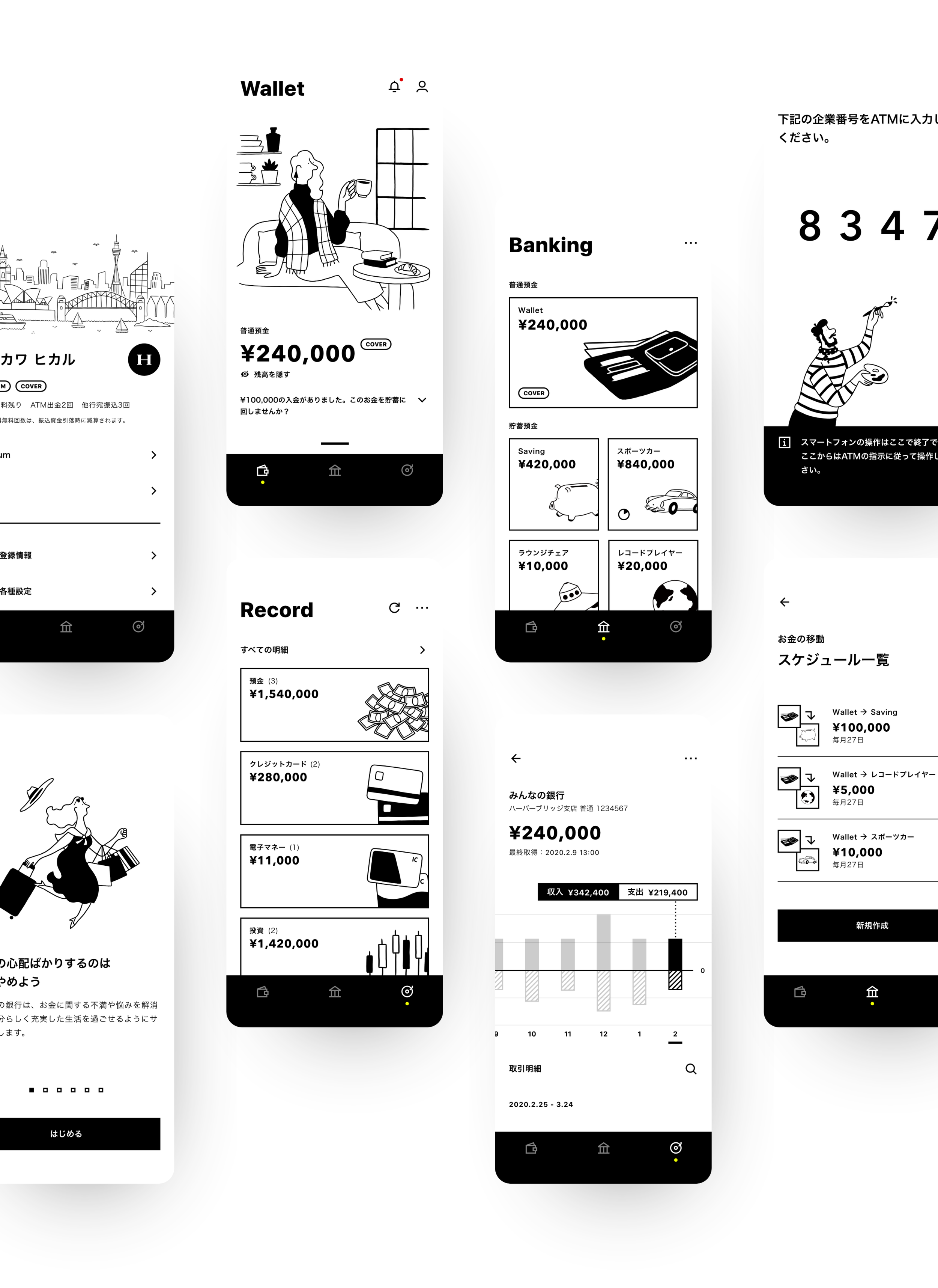
Created 4 design principles: Straight (trust), Minimal (clarity), Contrast (impact), Playful (warmth).
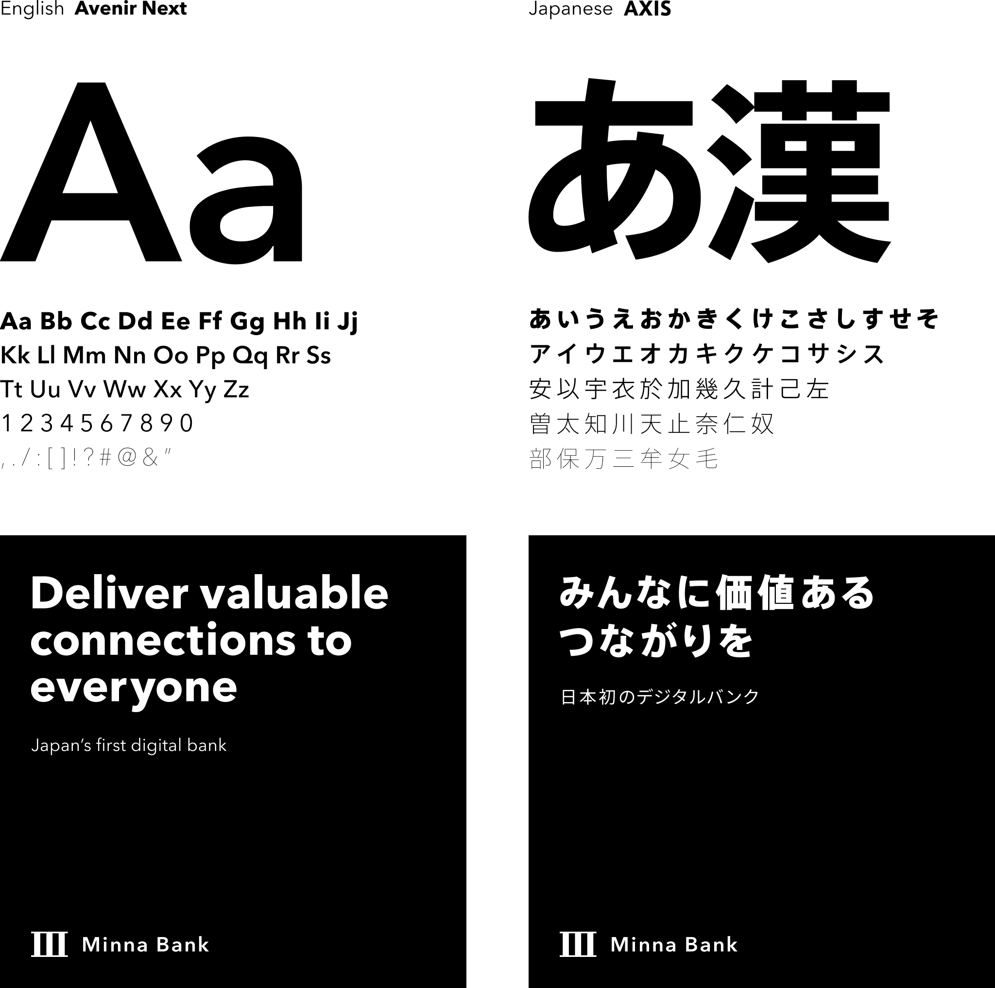
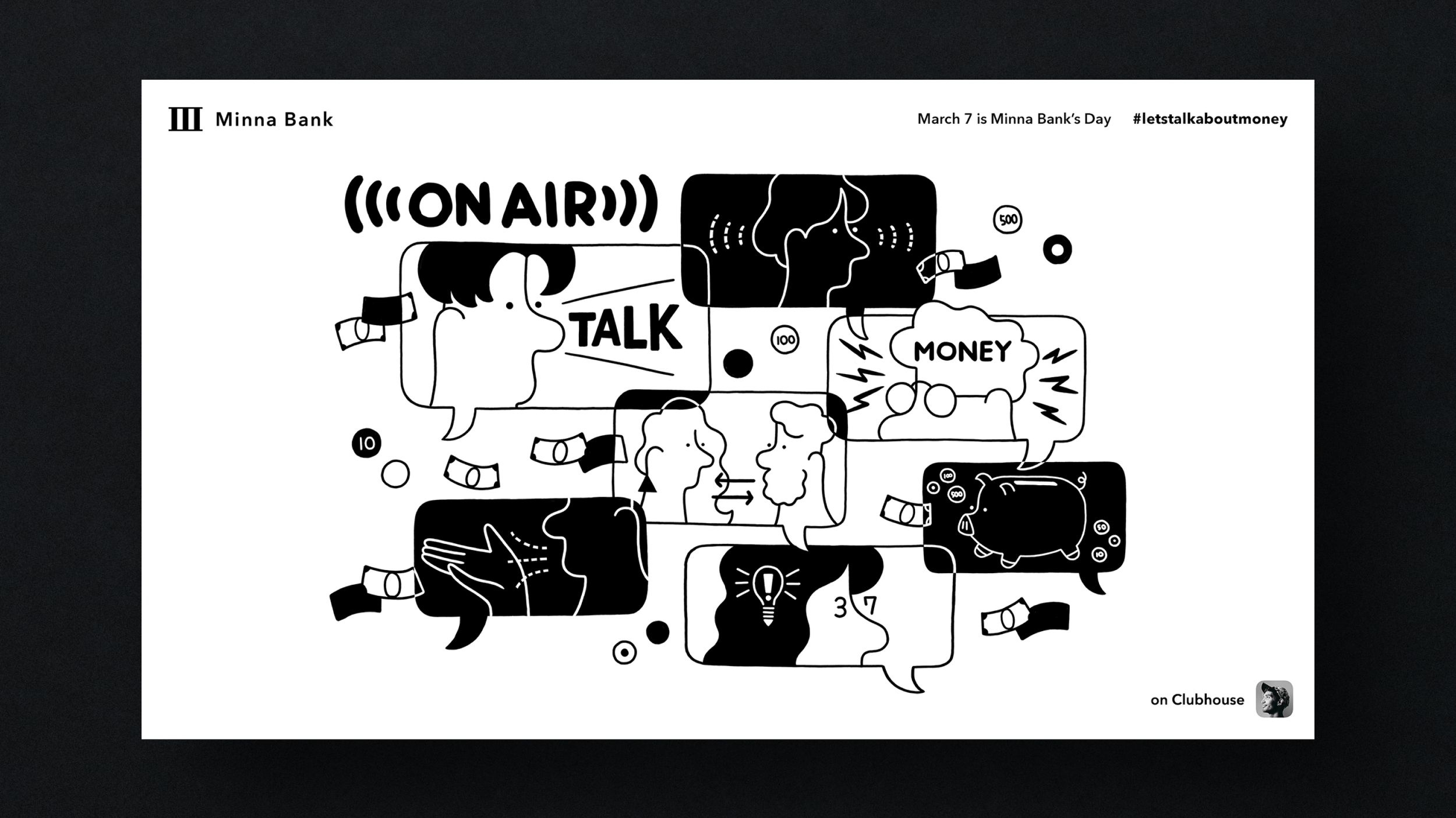
Used strong Roman numeral “III” + hand-drawn illustrations to balance rigidity and friendliness.
Adopted black & white with accent yellow for radical differentiation (vs. 85% of fintech being colorful).
Simplified UI: thumb-only operation, clear hierarchy for frictionless UX.
Validated through user testing: “No color, yet most reassuring.”
Result
Within 6 months: 80% brand recognition among Gen Z nationwide.
UGC on social media reached 5× the level of traditional banks.
Insight / Learning
Art Director’s role = transform abstract philosophy into scalable, concrete rules.
True value lies in solving deep consumer bias with strategic visuals—turning constraints (B/W, minimalism) into brand power.


AD: Doh Kim (Design Group, Minna Bank) | Collaboration: Accenture